
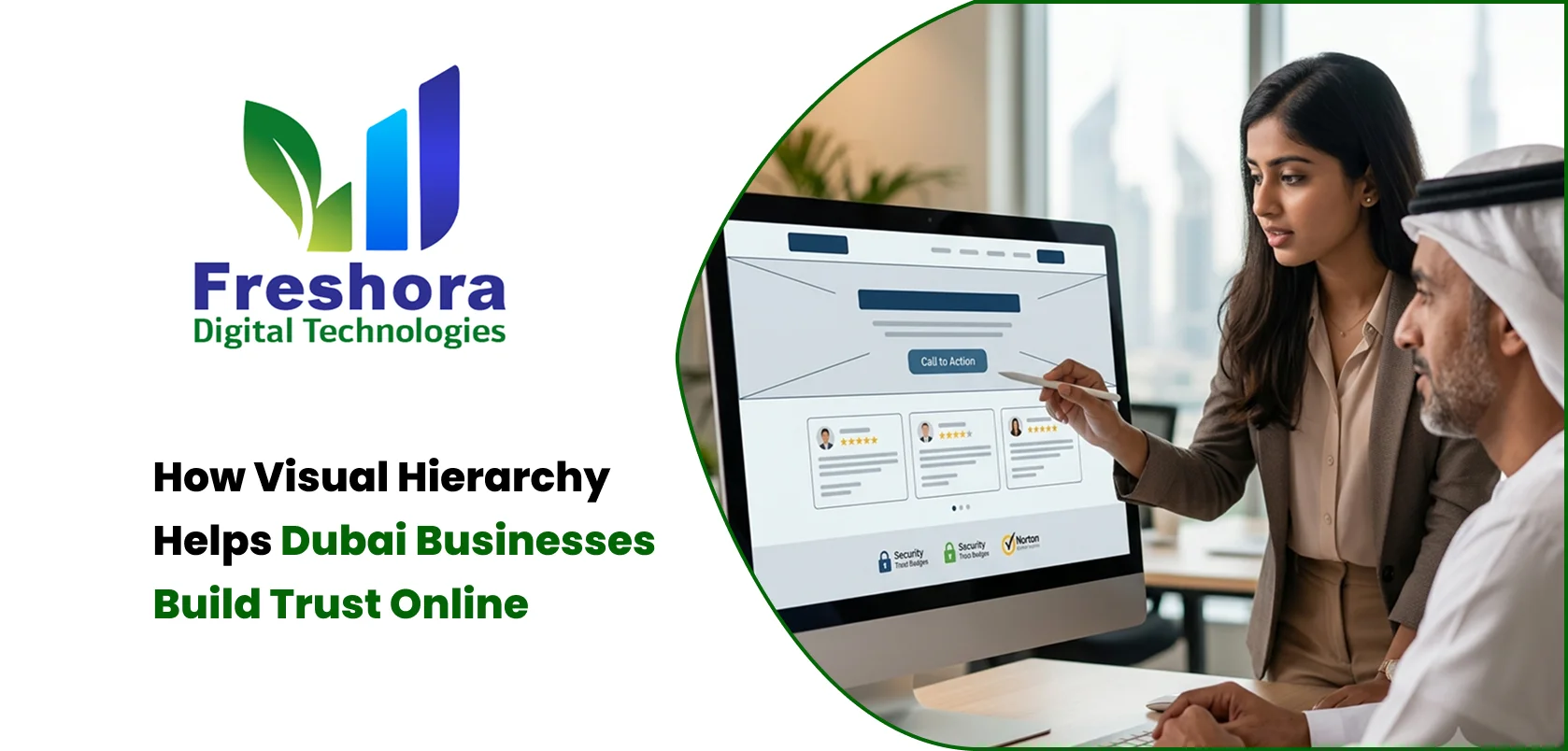
Contact our team for professional guidance and solutions.
Visual hierarchy helps visitors understand a website by making important information, credibility indicators, and next steps easy to identify. For businesses in Dubai, a well-organised website can communicate professionalism, reduce confusion, and help potential customers evaluate services with confidence. Clear headings, readable typography, consistent layouts, genuine trust signals, and well-placed calls to action work together to create a more reliable online experience.
When visitors land on a business website, they quickly form an impression based on how information is presented. A cluttered page, unclear messaging, inconsistent design, or difficult navigation can make a legitimate company appear less organised than it really is. By contrast, a website that presents its services, credentials, contact details, and next steps in a logical order helps visitors understand the business without unnecessary effort. This is particularly relevant for companies in Dubai that compete across industries and need to communicate their value to customers who may be comparing several providers. Visual design should therefore do more than make a website attractive; it should help visitors assess information, recognise important details, and decide what to do next. A deliberate approach to layout, typography, spacing, and credibility indicators can make the website feel more transparent and easier to use.
Visual hierarchy is the arrangement of website elements according to their importance. It guides attention by making some information more prominent than other information, helping visitors understand what to read first and which actions are available.
A business homepage might present a clear headline, a short explanation of its main service, evidence of its experience, and a contact option in that order. Supporting information can appear further down the page without competing with the main message.
A useful hierarchy answers three questions for visitors:
What does this business offer?
Why should I consider it?
What should I do if I am interested?
If visitors need to search through several sections to answer these questions, the page may need a clearer structure.
The purpose is not to make every important element large or colourful. It is to establish a deliberate relationship between headings, supporting text, images, evidence, and actions so that the entire page communicates a coherent message.
Visitors cannot always evaluate a company's service quality before making contact. They often use the website to assess whether the business appears credible, organised, and transparent.
A consistent interface can make information easier to understand, while contradictory details or confusing page structures can introduce uncertainty. For example, if a company advertises a service prominently but provides no clear explanation of its process, visitors may hesitate to enquire.
Website presentation can influence trust in several ways:
Clarity: Visitors can understand the offering without interpreting vague headlines or searching through unrelated content.
Consistency: Repeated design patterns make the website feel organised and predictable.
Transparency: Contact information, service details, policies, and relevant qualifications are easy to find.
Usability: Visitors can complete common tasks without unnecessary steps.
Credibility: Genuine evidence supports the company's claims rather than relying entirely on promotional language.
A polished layout cannot compensate for inaccurate information or poor service. Its role is to present reliable information clearly and help visitors evaluate the business on its actual merits.
Website Layout Design Dubai projects should begin with the information customers need, rather than with decorative elements alone. A useful layout follows the visitor's decision-making process.
For example, someone considering a professional service may want to understand the problem being solved, what the service includes, how the process works, and how to request a consultation.
A service page can follow that sequence:
Introduce the service: Explain what is offered and who it is intended for.
Describe the value: Show the practical problem the service addresses.
Explain the process: Set expectations about the steps involved.
Provide supporting evidence: Include relevant experience, examples, credentials, or genuine customer feedback.
Clarify the next step: Tell visitors how to enquire or request further information.
This structure helps prevent an important service page from becoming a collection of disconnected promotional sections.
The exact order should reflect the audience. A product page may need specifications and pricing earlier, while a complex business service may require more explanation before a visitor is ready to contact the company.
Typography in Web Design affects readability, tone, and the distinction between important information and supporting details. A website may contain accurate and useful content, but visitors can struggle to understand it if the text is cramped, inconsistent, or difficult to scan.
A practical typography system should establish clear styles for headings, paragraphs, labels, buttons, and supporting information.
Consider these principles:
Use headings that describe the content beneath them rather than relying on vague labels.
Maintain readable paragraph sizes and comfortable line spacing.
Limit the number of font families and weights to keep the interface consistent.
Make links and buttons visually distinguishable from ordinary text.
Avoid long passages in all capital letters or decorative fonts that reduce readability.
Ensure that text remains legible against its background on mobile and desktop screens.
Typography should also reflect the type of business. A financial consultancy may benefit from a restrained and structured presentation, while a creative studio may have more room for expressive type treatments.
The objective is to support comprehension and communicate the brand's personality without making visitors work harder to read the content.
Website Trust Signals UAE businesses use should provide relevant evidence rather than simply fill space with badges or promotional claims. Visitors are more likely to find these signals useful when they appear near the information they help validate.
For example, a company describing its technical expertise could place relevant qualifications or project examples near that explanation. An online store might present clear delivery, return, and payment information near the purchasing process.
Useful trust signals can include:
Accurate company information and accessible contact details.
Genuine customer testimonials published with appropriate permission.
Relevant certifications or professional memberships that can be verified.
Real examples of completed work or case studies.
Clear explanations of service processes and expected deliverables.
Appropriate privacy, payment, warranty, or return information.
The placement matters because trust signals should answer a question at the moment it arises. A visitor evaluating a company's experience may want to see relevant work samples before submitting an enquiry, while someone preparing to purchase may need clear payment and delivery information.
Avoid displaying unsupported awards, invented testimonials, or security claims that cannot be substantiated. Credibility depends on the accuracy of the evidence, not the number of badges displayed.
CTA Placement on Business Websites affects how easily visitors can move from reading information to taking action. A call to action should appear when visitors have enough context to understand why the next step is relevant.
For a service business, the main action might be requesting a quotation, scheduling a consultation, or contacting the team. For an online store, it could be viewing a product, adding an item to the cart, or completing a purchase.
Effective calls to action share several characteristics:
They use specific language that explains the expected action.
They stand out from surrounding content without overwhelming the page.
They appear near relevant information, such as service details or pricing.
They remain easy to access on mobile devices.
They lead to a page or process that matches the promise made by the button.
Avoid giving several unrelated actions equal visual prominence. If a page contains buttons for calling, downloading, subscribing, booking, and requesting a quote, visitors may be unsure which action matters most.
Choose one primary action for each page and use secondary actions only where they serve a clear purpose. The wording should also match the commitment involved: “Request a Quote” is more informative than a generic “Click Here” when visitors are seeking pricing.
Visual Website Design UAE businesses use should remain consistent across key pages so that visitors do not need to relearn the interface each time they navigate.
Consistency includes more than repeating the same colours. It also involves predictable navigation, heading styles, button behaviour, spacing, image treatment, and page structure.
A consistent website helps visitors recognise familiar elements and understand how to interact with them. If the main navigation changes unexpectedly between pages or similar buttons behave differently, the experience can feel unreliable.
A reusable design system can define:
Standard colours and typography styles.
Spacing rules for sections and content blocks.
Button sizes, shapes, and interaction states.
Form field styles and validation messages.
Common page templates and navigation patterns.
Image ratios and guidelines for using illustrations or photography.
Consistency should not mean every page must look identical. A product page and a company profile have different purposes, but both can use the same design principles and interface patterns.
This approach also makes future updates easier because new pages can follow established rules rather than introducing unrelated design decisions.
A hierarchy that works on a large desktop screen may not work equally well on a mobile device. When a page becomes narrower, multiple columns may stack vertically, headings may wrap, and important actions may move further down the screen.
Review the mobile version to ensure that the main message appears early, text remains readable, and important actions do not become difficult to find. Avoid allowing large decorative images to push essential service information too far down the page.
Businesses serving Arabic-speaking and English-speaking audiences should also test each language version independently. Arabic content uses right-to-left reading direction, which can affect navigation, alignment, icons, and form layouts.
The design should adapt to the language without losing the brand's consistency. Visitors should be able to identify the main service, understand supporting information, and locate the appropriate call to action in either version.
Mobile app and multilingual testing should use real content, not only placeholder text, because content length and reading direction can change how the layout behaves.
Some design decisions make a website appear busy or inconsistent even when the underlying business is credible.
Giving every element equal prominence: When headings, banners, buttons, and promotional messages all compete for attention, visitors struggle to identify the main message.
Using vague headlines: General statements such as “We Deliver Excellence” do not explain what the company actually does.
Hiding essential information: Visitors should not need to search extensively for service details, contact options, or relevant policies.
Overloading pages with animations: Motion effects can distract from content or interfere with usability when used without a clear purpose.
Using weak contrast: Text that blends into its background can make important information difficult to read.
Showing unverified trust badges: Unsupported credibility claims can undermine confidence instead of building it.
Using inconsistent button styles: If similar actions look different across pages, visitors may find the interface less predictable.
Ignoring mobile layouts: A design that is clear on desktop can become confusing when content is compressed onto smaller screens.
A useful review question is whether each element helps visitors understand the business, assess its credibility, or complete a relevant task. If it does none of these, it may not need to be prominent.
Visual hierarchy should be evaluated through user behaviour and task completion rather than personal preference alone. A design may look attractive in a presentation but still make it difficult for visitors to find information or submit enquiries.
Begin by identifying the main purpose of each important page. Then select measurements that help assess whether the layout supports that purpose.
|
Goal |
What to Review |
|
Improve service understanding |
User feedback and engagement with key service information |
|
Make contact easier |
Enquiry form completion and contact-action usage |
|
Improve navigation |
Successful visits to important pages and common navigation paths |
|
Reduce form friction |
Form abandonment and validation errors |
|
Improve mobile usability |
Mobile conversion performance and usability feedback |
|
Support content discovery |
Internal link usage and relevant page engagement |
Analytics can show where users interact or leave, but the figures do not always explain why. Usability testing, customer interviews, and session analysis where appropriate can help identify the underlying problem.
For example, if a page receives relevant visits but produces few enquiries, the issue might be unclear service information, weak trust evidence, an inconvenient form, or a mismatch between visitor intent and the call to action. Test one meaningful change at a time where possible and compare results over a suitable period.
A measured approach helps businesses improve the experience without redesigning the entire website based on assumptions.
Consider a Dubai-based business consultancy that wants to attract enquiries from small and medium-sized companies. Its homepage could begin with a specific headline explaining the service and the type of client it supports.
The next section could explain the main business problems addressed, followed by a concise overview of the consultancy's process. Relevant experience or genuine case studies could support the claims, while a clearly labelled consultation button would give interested visitors a direct next step.
The service pages could then provide deeper explanations, answer common questions, and include contact options close to relevant information. The mobile layout would keep the essential message and primary action accessible without overwhelming visitors with multiple competing elements.
This approach creates a connected experience: the headline explains the offer, the content clarifies its value, the evidence supports credibility, and the call to action provides a logical next step.
Businesses reviewing their website design can explore Freshora Digital Technologies at for website-related solutions aligned with their digital requirements.
The same principles can be adapted to other industries, but the order and type of information should always reflect the questions customers need answered before making a decision.
Visual hierarchy helps businesses communicate clearly by organising information according to what visitors need to understand and evaluate. For companies in Dubai, a considered approach to layout, typography, trust signals, and calls to action can make the website easier to navigate and help potential customers assess the business with greater confidence. The strongest results come from combining a consistent design system with accurate information, genuine evidence, mobile usability, and clear next steps. Rather than filling pages with decorative elements or promotional claims, businesses should prioritise the content that helps visitors make informed decisions. Measuring how people use the website can then reveal where the experience needs improvement. When design choices support clarity, transparency, and usability, the website becomes a more effective representation of the business and a stronger foundation for customer relationships.
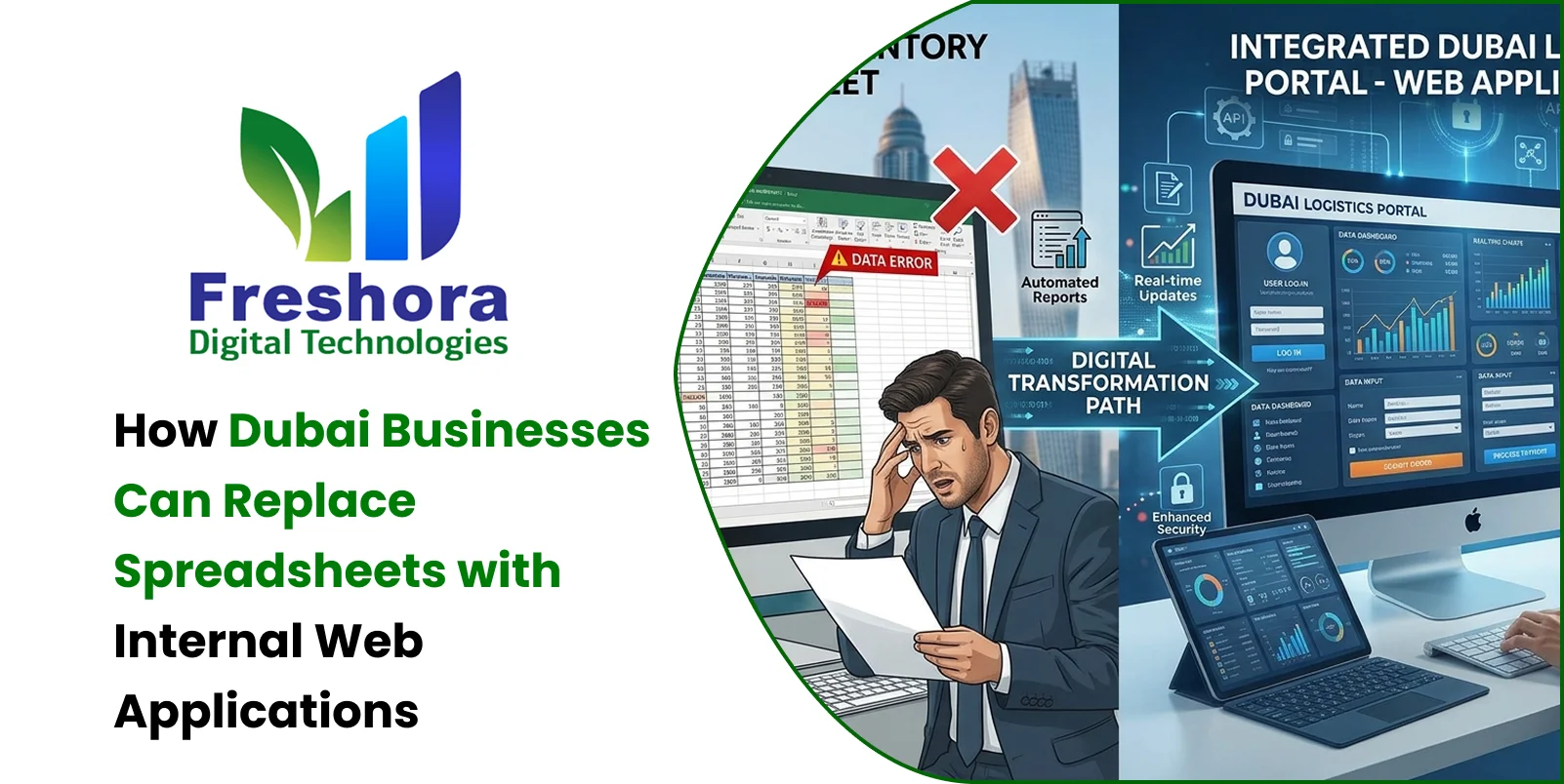
Quick Answer Dubai businesses can replace spreadsheets with internal web applications when shared f... Read More
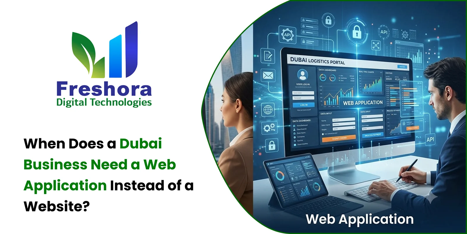
Quick Answer A Dubai business needs a web application instead of a standard website when customers,... Read More
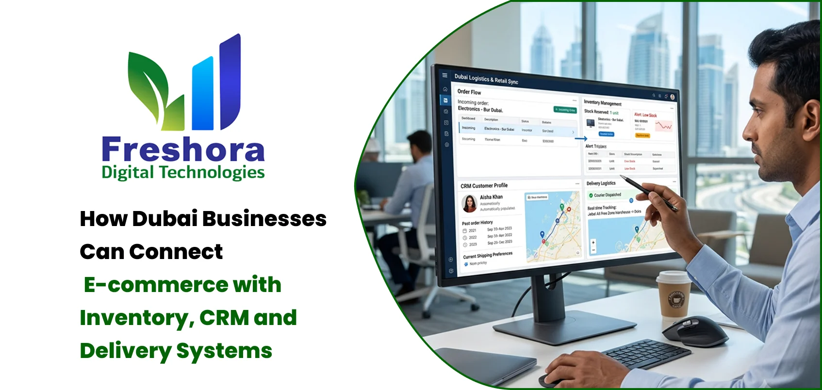
Quick Answer E-commerce integration connects an online store with the business systems that manage... Read More
Our expert will call you shortly to understand your needs and help grow your business.
Get exclusive digital marketing tips, SEO insights, web & app updates, and job opportunities delivered straight to your inbox.
Join our WhatsApp channel for instant digital marketing tips, SEO insights, web & app updates, and latest job opportunities.
Join NowFreshora Digital Technologies proudly serves businesses across Dubai, including Downtown Dubai, Business Bay, Dubai Marina, Jumeirah, Jumeirah Lake Towers (JLT), Jumeirah Village Circle (JVC), Jumeirah Village Triangle (JVT), Palm Jumeirah, Dubai Internet City, Dubai Media City, Dubai Silicon Oasis, Dubai International Financial Centre (DIFC), Dubai Design District (d3), Dubai Healthcare City, Dubai Knowledge Park, Dubai Sports City, Motor City, Arabian Ranches, Al Barsha, Barsha Heights (TECOM), Emirates Hills, The Springs, The Meadows, The Greens, Mirdif, Deira, Bur Dubai, Al Karama, Al Qusais, Al Nahda, Al Rigga, Oud Metha, Umm Suqeim, Al Safa, Al Wasl, City Walk, Dubai Hills Estate, Dubai South, Dubai Investment Park (DIP), Jebel Ali, Jebel Ali Free Zone (JAFZA), Ras Al Khor Industrial Area, Al Quoz Industrial Area, Dubai Industrial City, International City, Dubai Festival City, Dubai Creek Harbour, Nad Al Sheba, Academic City, Bluewaters Island, The World Islands, Expo City Dubai, Dubai Airport Free Zone (DAFZA), and Dubai Airport.
We also serve businesses across the United Arab Emirates, including Abu Dhabi, Sharjah, Ajman, Umm Al Quwain, Ras Al Khaimah, and Fujairah. Our services extend across the GCC region, including Saudi Arabia, Qatar, Kuwait, Bahrain, and Oman, as well as international markets such as India, Singapore, Canada, Australia, the United Kingdom, and the United States. Freshora Digital Technologies provides Website Development, Mobile App Development, Software Development, SEO, Google Business Profile Management, Digital Marketing, UI/UX Design, E-commerce Development, AI Solutions, and other digital technology services tailored to different industries and business requirements. We help businesses strengthen their online visibility, generate qualified enquiries, improve customer engagement, and support sustainable digital growth.

